Geev
GreenTech
Increasing sign-ups through mobile onboarding redesign
UX Research
Mobile Design
I redesigned Geev’s 7-step onboarding into a 4-step value-first flow. I reduced friction at every stage and increased Android conversion by 12.9% in the first month post-launch.
+12.9%
Android conversion
+5.9%
iOS conversion
1M+
Community members
8mo
From kickoff to full adoption
The Challenge
A giving app that made giving feel like a chore.
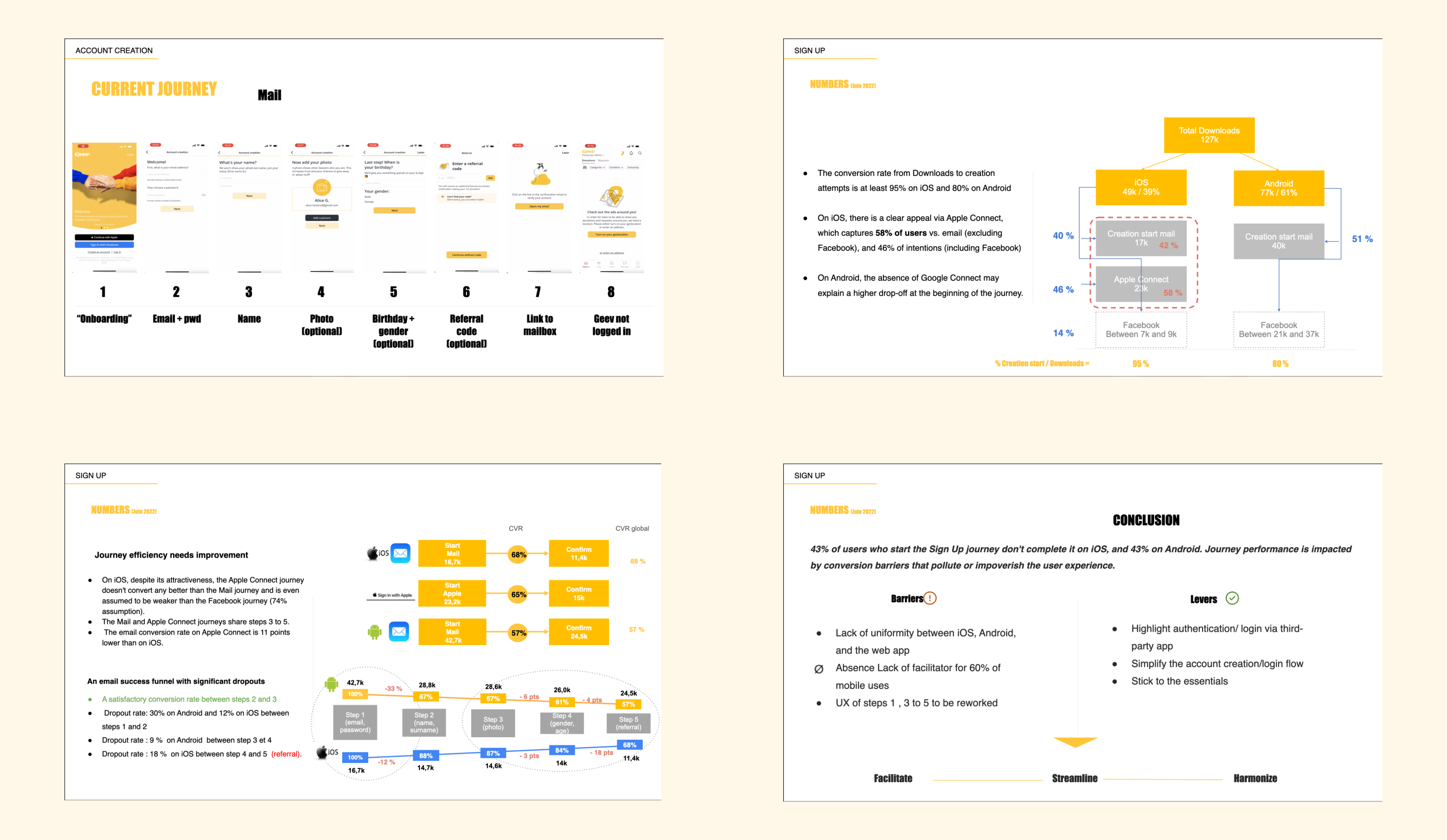
Geev connects people who have things to give with people who need them. It’s a powerful idea with 1M+ users in France. But the onboarding was designed for completeness, not conversion. Users were asked for a full account before they'd ever seen the product.
Commitment before value
Users were asked for personal details, email verification, and profile photo before experiencing a single feature. The cost of joining felt higher than the perceived value.
7-step funnel with no value preview
Users had to create a full account before seeing any nearby items. No preview, no hook, no reason to stay — exactly where our drop-off data confirmed the highest churn.
No session persistence
Abandoning mid-flow meant starting over. Users who came back found no trace of their progress, adding another layer of friction to an already demanding flow.
My Approach
My process, step by step.
01
Drop-off analysis & ergonomic audit
Mapped the funnel using Amplitude data. Friction peaked at step 4 (email verification), confirmed the drop-off wasn’t about intent but about premature commitment.
02
Value-first restructuring
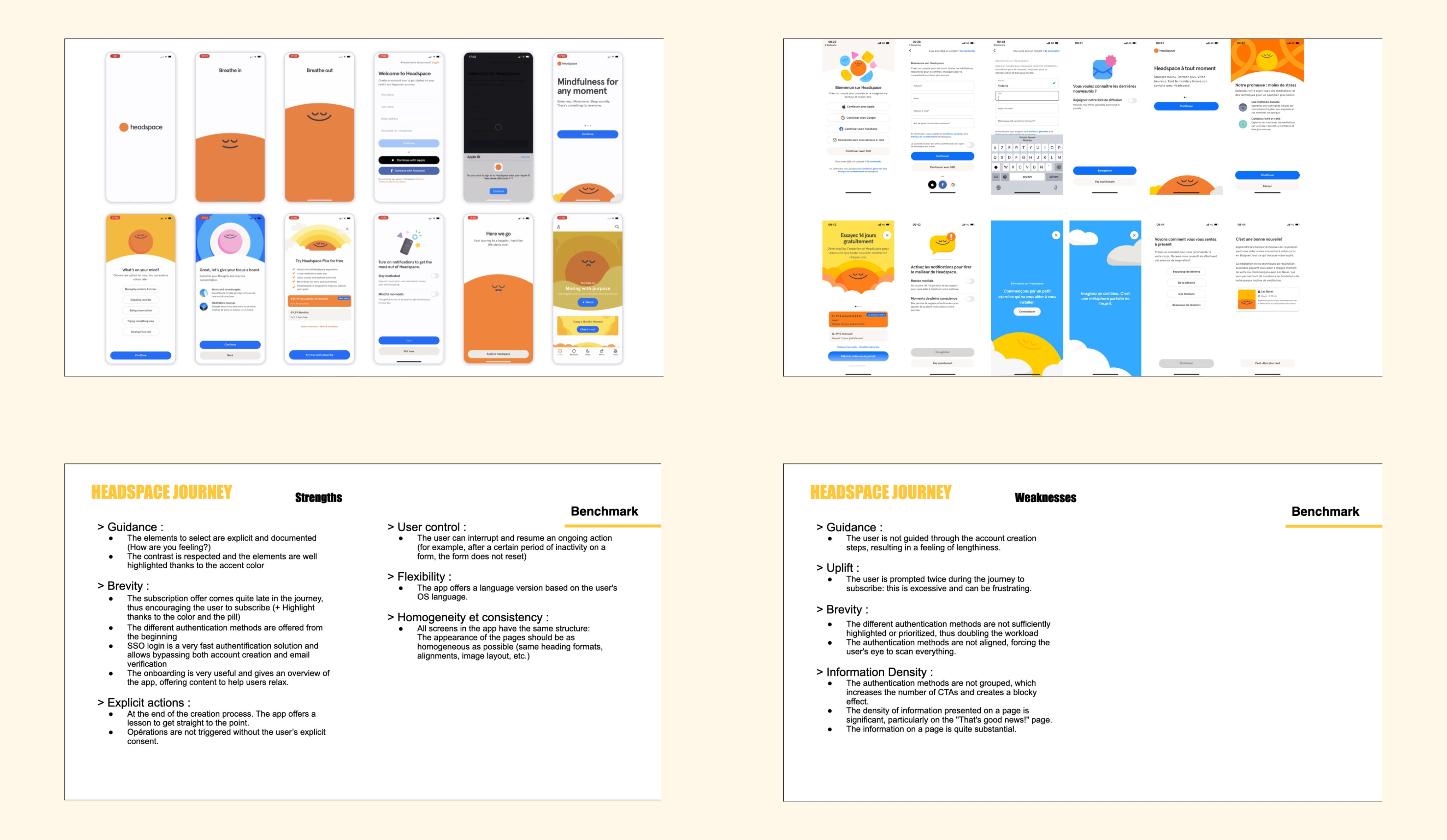
Studied Vinted, Leboncoin, Depop: all show value before asking for an account. Identified value-first as the key architectural change and show nearby items before any sign-up prompt.
03
Flow simplification to 4 steps
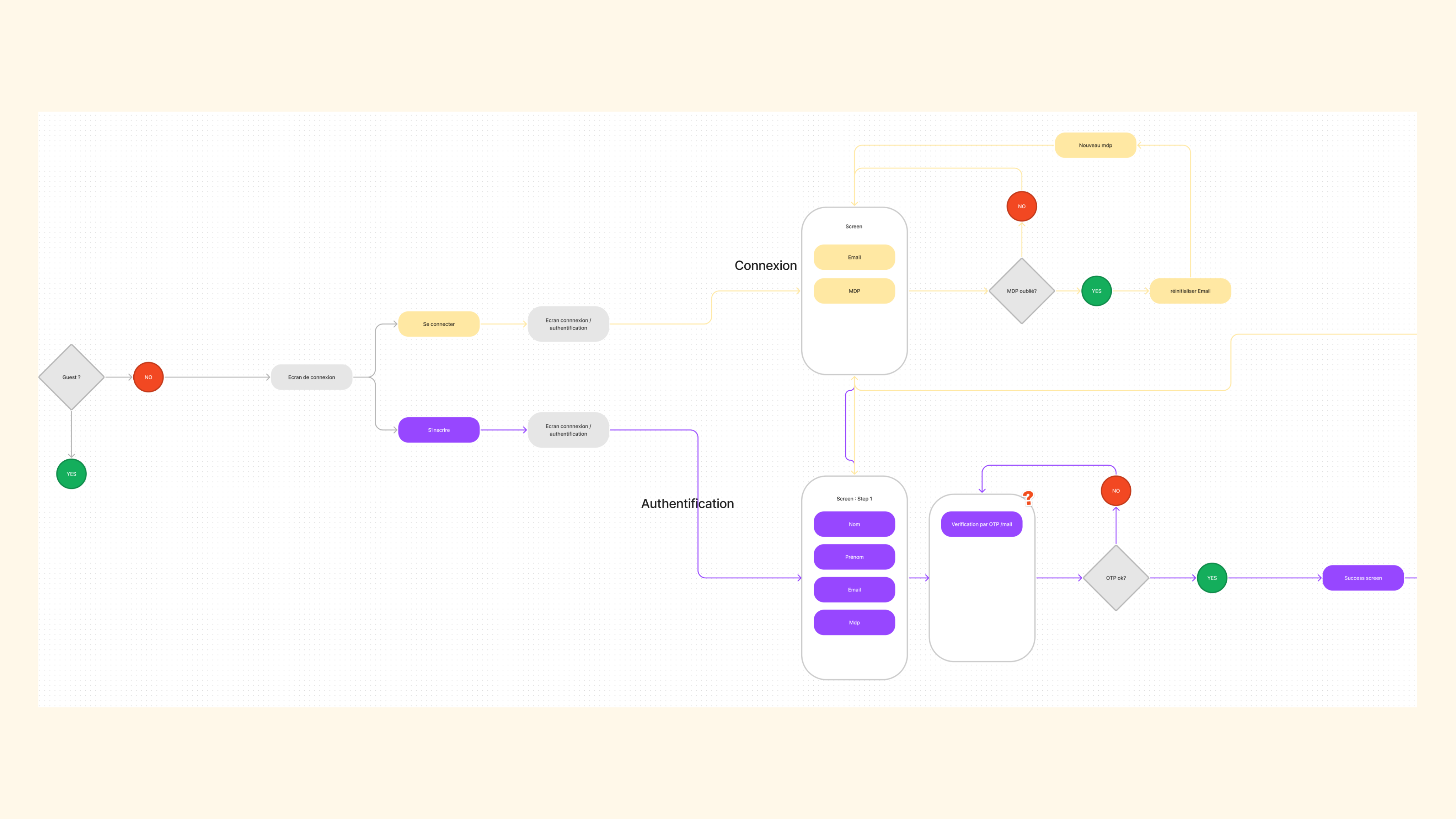
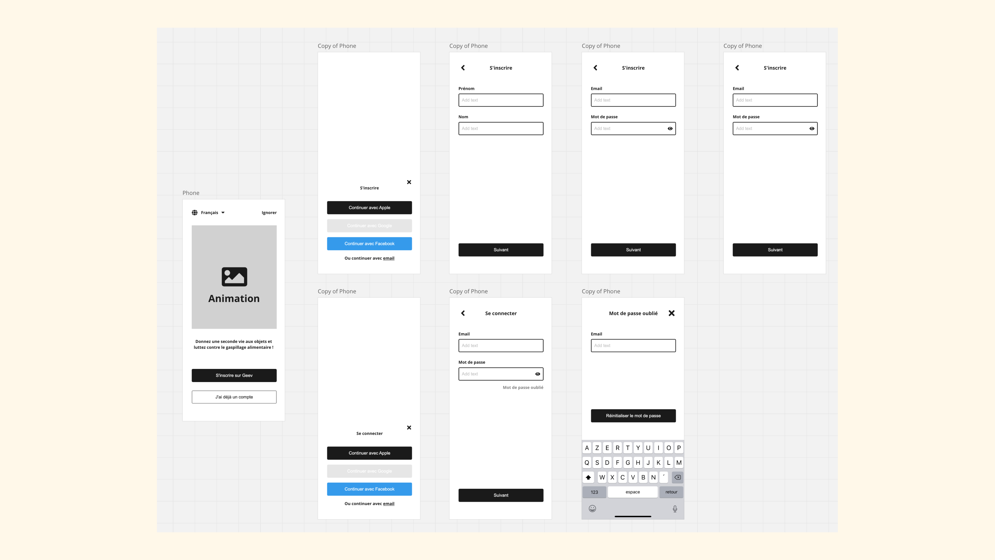
Rebuilt the flow to 4 steps, ran unmoderated remote tests with 12 participants, iterated twice before dev handoff. Deferred optional profile data to post-sign-up.
Key Decision
"Remove 3 screens. Research showed friction peaked at step 4; not because users didn't want to join, but because they hadn't yet seen why they should. Value before commitment."
The Solution
Feel the value before you commit.
A 4-step onboarding that leads with nearby items, defers non-essential data, and shows users real value before asking for a real account. Built and validated with unmoderated user tests.
Impact
More sign-ups. Less friction.
What I'd do differently: Run an A/B test between value-first and a shorter traditional flow to have stronger quantitative evidence for the architectural decision alongside the qualitative research.
+12.9%
Android conversion
+5.9%
iOS conversion
1M+
Community members
8mo
From kickoff to full adoption
© 2026 Victoria Pereira
Made with Figma
Geev
GreenTech
Increasing sign-ups through mobile onboarding redesign
UX Research
Mobile Design
I redesigned Geev’s 7-step onboarding into a 4-step value-first flow. I reduced friction at every stage and increased Android conversion by 12.9% in the first month post-launch.
+12.9%
Android conversion
+5.9%
iOS conversion
1M+
Community members
8mo
From kickoff to full adoption
The Challenge
A giving app that made giving feel like a chore.
Geev connects people who have things to give with people who need them. It’s a powerful idea with 1M+ users in France. But the onboarding was designed for completeness, not conversion. Users were asked for a full account before they'd ever seen the product.
Commitment before value
Users were asked for personal details, email verification, and profile photo before experiencing a single feature. The cost of joining felt higher than the perceived value.
7-step funnel with no value preview
Users had to create a full account before seeing any nearby items. No preview, no hook, no reason to stay — exactly where our drop-off data confirmed the highest churn.
No session persistence
Abandoning mid-flow meant starting over. Users who came back found no trace of their progress, adding another layer of friction to an already demanding flow.
My Approach
My process, step by step.
01
Drop-off analysis & ergonomic audit
Mapped the funnel using Amplitude data. Friction peaked at step 4 (email verification), confirmed the drop-off wasn’t about intent but about premature commitment.
02
Value-first restructuring
Studied Vinted, Leboncoin, Depop: all show value before asking for an account. Identified value-first as the key architectural change and show nearby items before any sign-up prompt.
03
Flow simplification to 4 steps
Rebuilt the flow to 4 steps, ran unmoderated remote tests with 12 participants, iterated twice before dev handoff. Deferred optional profile data to post-sign-up.
Key Decision
"Remove 3 screens. Research showed friction peaked at step 4; not because users didn't want to join, but because they hadn't yet seen why they should. Value before commitment."
The Solution
Feel the value before you commit.
A 4-step onboarding that leads with nearby items, defers non-essential data, and shows users real value before asking for a real account. Built and validated with unmoderated user tests.
Impact
More sign-ups. Less friction.
What I'd do differently: Run an A/B test between value-first and a shorter traditional flow to have stronger quantitative evidence for the architectural decision alongside the qualitative research.
+12.9%
Android conversion
+5.9%
iOS conversion
1M+
Community members
8mo
From kickoff to full adoption
© 2026 Victoria Pereira
Made with Figma
Geev
B2B · Fintech
Increasing sign-ups through mobile onboarding redesign
UX Research
Mobile Design
Built a multi-brand design system adopted across 10+ products — cutting design-to-dev handoff by 30% and aligning 5 product teams on a shared visual language.
+12.9%
Android conversion
+5.9%
iOS conversion
1M+
Community members
8mo
From kickoff to full adoption
The Challenge
A giving app that made giving feel like a chore.
Geev connects people who have things to give with people who need them. It’s a powerful idea with 1M+ users in France. But the onboarding was designed for completeness, not conversion. Users were asked for a full account before they'd ever seen the product.
Commitment before value
Users were asked for personal details, email verification, and profile photo before experiencing a single feature. The cost of joining felt higher than the perceived value.
7-step funnel with no value preview
Users had to create a full account before seeing any nearby items. No preview, no hook, no reason to stay — exactly where our drop-off data confirmed the highest churn.
No session persistence
Abandoning mid-flow meant starting over. Users who came back found no trace of their progress, adding another layer of friction to an already demanding flow.
My Approach
My process, step by step.
01
Drop-off analysis & ergonomic audit
Mapped the funnel using Amplitude data. Friction peaked at step 4 (email verification), confirmed the drop-off wasn’t about intent but about premature commitment.
02
Value-first restructuring
Studied Vinted, Leboncoin, Depop: all show value before asking for an account. Identified value-first as the key architectural change and show nearby items before any sign-up prompt.
03
Flow simplification to 4 steps
Rebuilt the flow to 4 steps, ran unmoderated remote tests with 12 participants, iterated twice before dev handoff. Deferred optional profile data to post-sign-up.
Key Decision
"Remove 3 screens. Research showed friction peaked at step 4; not because users didn't want to join, but because they hadn't yet seen why they should. Value before commitment."
The Solution
Feel the value before you commit.
A 4-step onboarding that leads with nearby items, defers non-essential data, and shows users real value before asking for a real account. Built and validated with unmoderated user tests.
Impact
More sign-ups. Less friction.
What I'd do differently: Run an A/B test between value-first and a shorter traditional flow to have stronger quantitative evidence for the architectural decision alongside the qualitative research.
+12.9%
Android conversion
+5.9%
iOS conversion
1M+
Community members
8mo
From kickoff to full adoption
© 2026 Victoria Pereira
Made with Figma